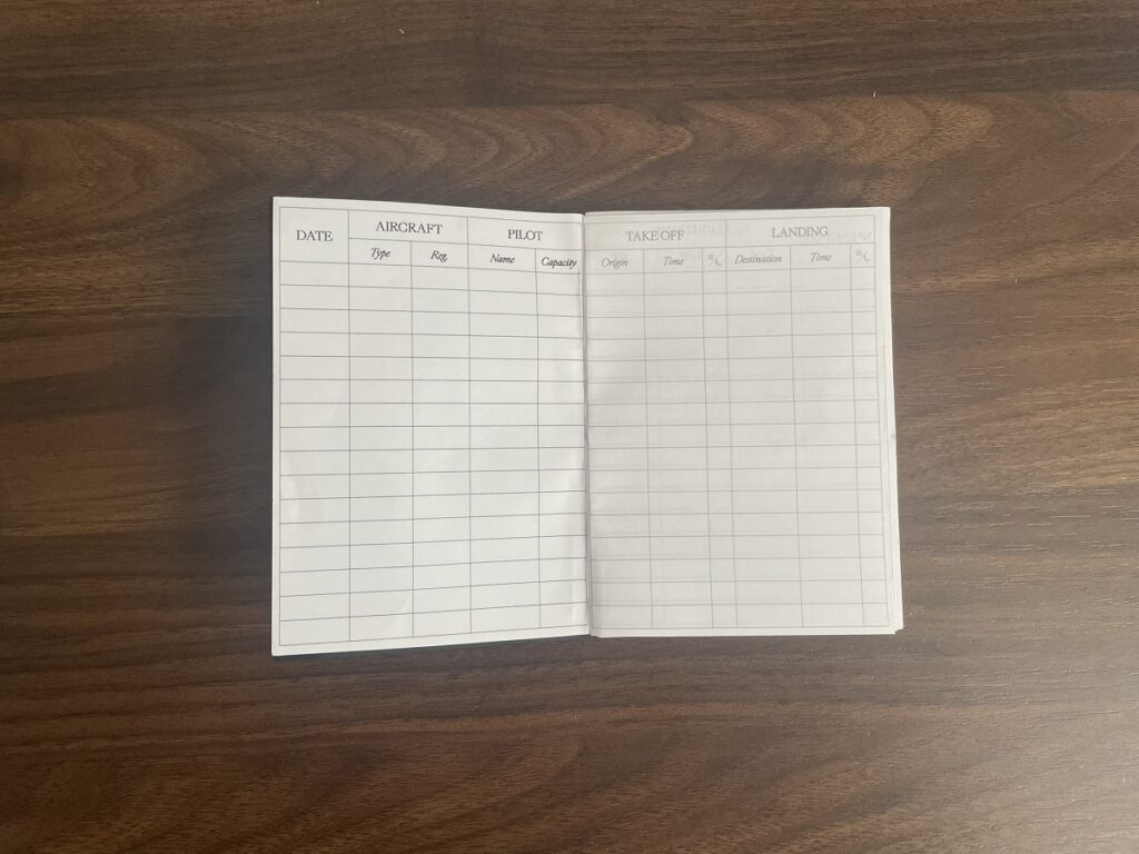
After researching and experimenting various page layouts, print options and binding methods, I have completed the first prototype. This prototype tests the page layout design and usability, binding technique, and overall user experience.
Each section is thoughtfully laid out to provide an effortless writing experience, with subtle grid lines that guide entries without ever overwhelming your focus. The clean, simple sans-serif font enhances legibility, ensuring that you can record your progress with clarity. The carefully balanced column and row sizes provide enough space for notes to breathe, while still keeping it compact and organised. Icons and symbols replace text in key places, saving space without sacrificing functionality.
The binding methods were narrowed down to saddle stitching and perfect binding. While saddle stitch binding is durable, it presents an issue when folding bundled pages together; causing the inner pages to protrude beyond the edges, a problem known as page creep. Trimming this excess often results in the loss of printed content, requiring each page to be individually adjusted to compensate (a process called shingling).
To avoid unnecessary complexity, poor finish quality, and a compromised user experience, my research concluded that perfect binding is the most suitable choice, due to its neat finish and the elimination of complexity in the print layout adjustments.

The feedback from the prototype has been valuable. It was made with 150gsm Canford Paper in Jet Black by Daler-Rowney, combined with the gluing technique delivered subpar results. The cover was thiner than necessary and the glue seeped over he fist page attaching more contact area of the cover to the first page.
To improve the bind, I will use archival-quality, pH-neutral PVA glue as the binding adhesive to ensure long-term durability and to prevent the pages from yellowing over time. Additionally, I will opt for a thicker, higher-quality material for the cover to provide better structure and a more refined finish.